Choosing the right colors for your home can feel overwhelming, but it doesn’t have to be. With a basic understanding of color theory and a few simple guidelines, you can create beautiful, cohesive spaces that reflect your style and make every room feel just right. Here’s your crash course in picking the perfect palette for any room in your house.
Start with the Basics: Understanding Color Theory
Color theory is simply the science and art of using colors together. The color wheel — a visual representation of primary, secondary, and tertiary colors — is your best tool. Here are a few key concepts to know:
- Complementary Colors: Colors opposite each other on the wheel, like blue and orange, create bold, energetic contrasts.
- Analogous Colors: Colors next to each other, like blue, blue-green, and green, feel harmonious and relaxing.
- Monochromatic Colors: Different shades and tints of a single color create a sophisticated, layered look.
Understanding these relationships helps you mix and match colors with confidence.
Consider the Room’s Purpose
Think about how you want each space to feel. Color has a powerful effect on mood:
- Bedrooms: Soft, cool colors like blues, greens, and lavenders promote calm and relaxation.
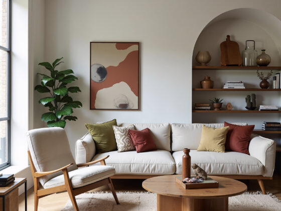
- Living Rooms: Warm neutrals, muted greens, and soft yellows create a welcoming, cozy atmosphere.
- Kitchens: Bright, energetic colors like yellows, reds, and even vibrant blues can stimulate appetite and conversation.
- Bathrooms: Crisp whites, light blues, and seafoam greens give a clean, spa-like feel.
- Home Offices: Blues and greens enhance focus and productivity, while touches of yellow can boost creativity.
Matching your color choices to a room’s purpose ensures the space not only looks good but feels right, too.
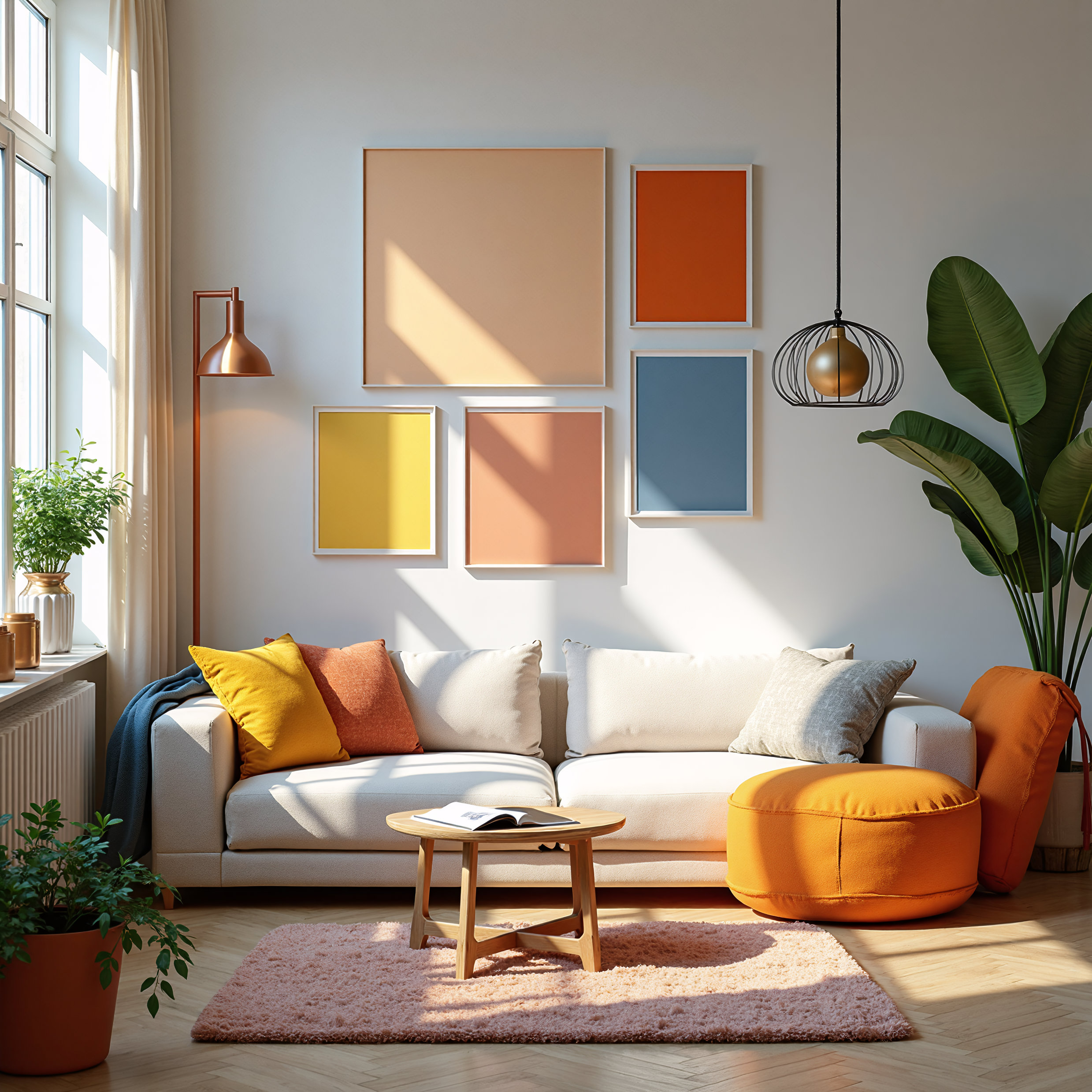
Pick a Dominant Color, Then Build Around It
Start by choosing one main color that sets the tone for the room. Then, layer in secondary and accent colors:
- 60% of the room should be your dominant color (walls, large furniture pieces)
- 30% should be your secondary color (textiles, curtains, area rugs)
- 10% should be an accent color (decorative pillows, art, accessories)
This 60-30-10 rule helps create visual balance and keeps a room from feeling too chaotic or flat.
Use Neutrals as Anchors
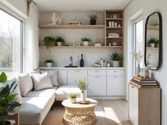
Neutrals like white, beige, gray, and black are essential for balancing bolder hues. They provide breathing room for the eye and make colorful elements stand out. Think of neutrals as the canvas that allows your pops of color to shine without overwhelming the space.
Think About Lighting
Natural and artificial light can drastically change the way colors appear. A paint color that looks perfect in a store might seem too dark or too bright once it’s on your walls. Always test large swatches in different lighting throughout the day before committing. North-facing rooms tend to bring out cooler tones, while south-facing rooms make colors feel warmer.
Pull Inspiration from What You Love
One of the easiest ways to choose a color palette is to start with something you already adore — a favorite piece of artwork, a patterned rug, or even a beloved outfit. Pull colors directly from those inspirations to create a palette that feels authentic and personal.
Don’t Be Afraid of Bold Choices
If you love deep emerald green, dramatic navy, or a vibrant mustard yellow, embrace it. Accent walls, painted ceilings, and colorful doors are all creative ways to incorporate bold colors without overwhelming a space.
Final Thoughts
Picking the perfect palette doesn’t have to be intimidating. By understanding basic color relationships, thinking about the mood you want to create, and layering colors intentionally, you can design rooms that feel effortlessly beautiful and completely you. With a little color theory in your back pocket, your dream home is just a few brushstrokes away.